UX/UI Project

Project Type
iOS Mobile App
Role
Solo UX/UI Designer
Tools
Figma, Typeform, Google Meet, Notion, Photoshop
Timeline
5 weeks
Overview
Anita's coaching was powerful - but invisible inside her app
UPLIFT is an end-to-end UX/UI project where I designed the MVP of a personalized coaching app and a refreshed brand identity for Anita, a women’s fitness coach specializing in female training across all life stages, including pregnancy and postpartum. Her brand is built on empathy, balance, and personalized care - helping women feel strong, supported, and confident in their bodies.
The Challenge
Replace fragmented tools with a branded, emotionally intelligent platform that centralizes workouts, communication, and progress.
The Solution
Designed an MVP + refreshed brand identity that blends operational efficiency with human warmth.
USER INTERVIEWS & SURVEY
Emotional support matters as much as the workout plan itself
Interviews with Anita and 3 clients, plus a survey of 36 women, revealed one consistent pattern: structure alone wasn't enough - motivation and emotional connection needed to be designed directly into the product.
“Anita knows when to slow you down, when to motivate you, and how to make it feel personal.”
- client
“My job is 50% training, 50% listening. The app should help me keep that balance.”
- Anita
“I use the app to see what to do but then I text her on WhatsApp. That’s where I really feel supported.”
- client
64% prioritized personalized workouts
42% valued emotional support as much as training
72% struggled primarily with motivation
COMPETITIVE ANALYSIS
No product on the market combines professional structure with true emotional warmth
I evaluated Anita's current setup alongside direct and indirect competitors across two categories — admin-heavy platforms and branded wellness apps — to find where the real opportunity lived.
Admin-heavy coaching platforms

Powerful automation
Workout builders
Scalable business tools
Overwhelming dashboards
Generic, transactional tone
Limited emotional engagement
Built for efficiency, not empathy
Branded women’s wellness apps


Strong brand identity
Motivational tone
Community & visual harmony
Pre-recorded programs
No real-time coaching
Limited personalization
Built for belonging, not deep guidance
Affinity map
Anita's superpower was happening outside the app - on WhatsApp
Synthesizing the research through affinity mapping revealed five clear themes. The biggest: her emotional presence was what differentiated her, but no digital tool was designed to carry it.
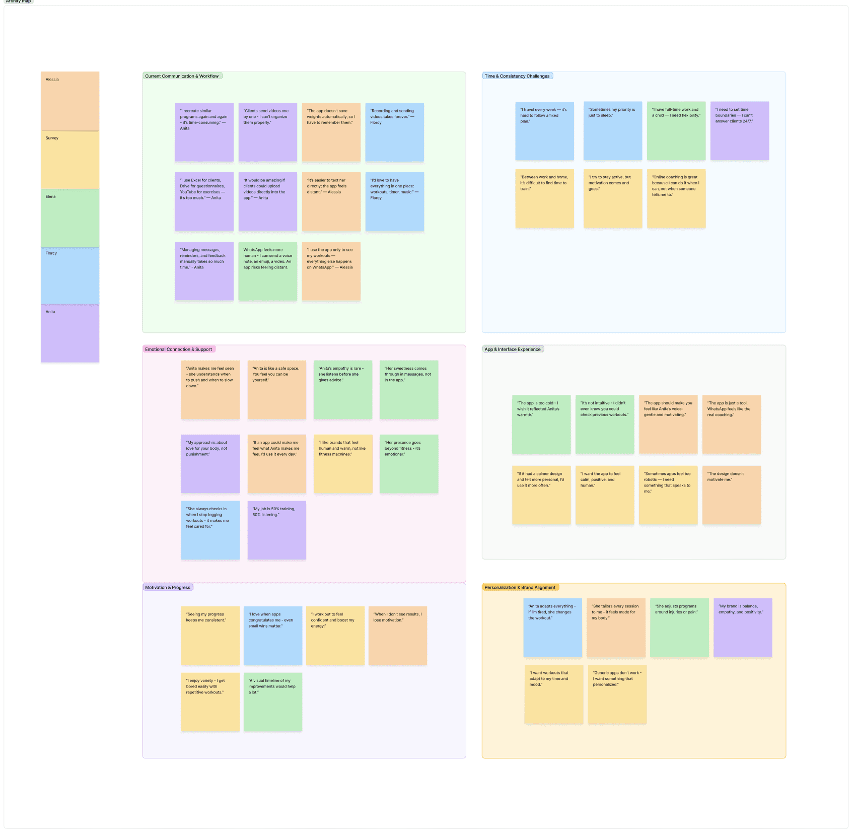
Fragmented communication & workflows
The coaching process is fragmented across multiple tools - Anita and clients both lose time and context.
Emotional connection & support
The emotional presence of Anita is what differentiates her from other trainers.
Personalization & brand alignment
Anita’s brand is defined by balance, empathy, and self-love - the app should reflect that.
Time and consistency challenges
Both trainer and clients struggle to stay consistent within busy schedules.
Motivation through progress
Seeing progress fuels engagement, but tracking is manual and scattered.
→ Emotional support must be designed into the app
→ Structure should guide, not overwhelm
→ Progress needs to feel visual and encouraging
→ The product must balance empathy with scalability
User persona
Kate is a busy mum who wants a coach who gets her, not just a program to follow
Meet Kate, 34, Marketing Manager, Milan. She guided every design decision — making sure the product stayed supportive, flexible, and human, not just functional.

GOALS ALIGNMENT
The best solution had to work for Anita's business and Kate's life at the same time
Balancing coach and client needs led to a clear set of shared goals: unify Anita's workflow while delivering a supportive, personalized experience that keeps users motivated.

POV & HMW
The real problem wasn't the workouts - it was the experience between them
With goals defined, I framed the core problem and four How Might We questions to direct ideation toward emotional authenticity, not just feature completeness.
Problem
The current online coaching experience is fragmented and doesn’t reflect Anita’s empathetic, human-centered approach, making it difficult to deliver a seamless and meaningful digital experience for her clients.
HOW MIGHT WE...
... translate Anita’s warmth and empathy into a digital experience that feels human and authentic?
... bring workouts, communication, and progress tracking into one clear, cohesive platform?
... support motivation and emotional connection without overwhelming users?
... how might we help Anita scale her coaching while preserving personal boundaries and trust?
FEATURE PRIORITIZATION
Four MVP features that close the gap between sessions
Prioritizing ruthlessly, I focused the MVP on the features that solved the core tension — centralizing Anita's workflow while keeping warmth and personalization intact.
P1 MUST HAVE
P2 - P3 NICE TO HAVE - CAN COME LATER
Payments
Community
Food journal
Cycle track
Mood tracker
Health app integration
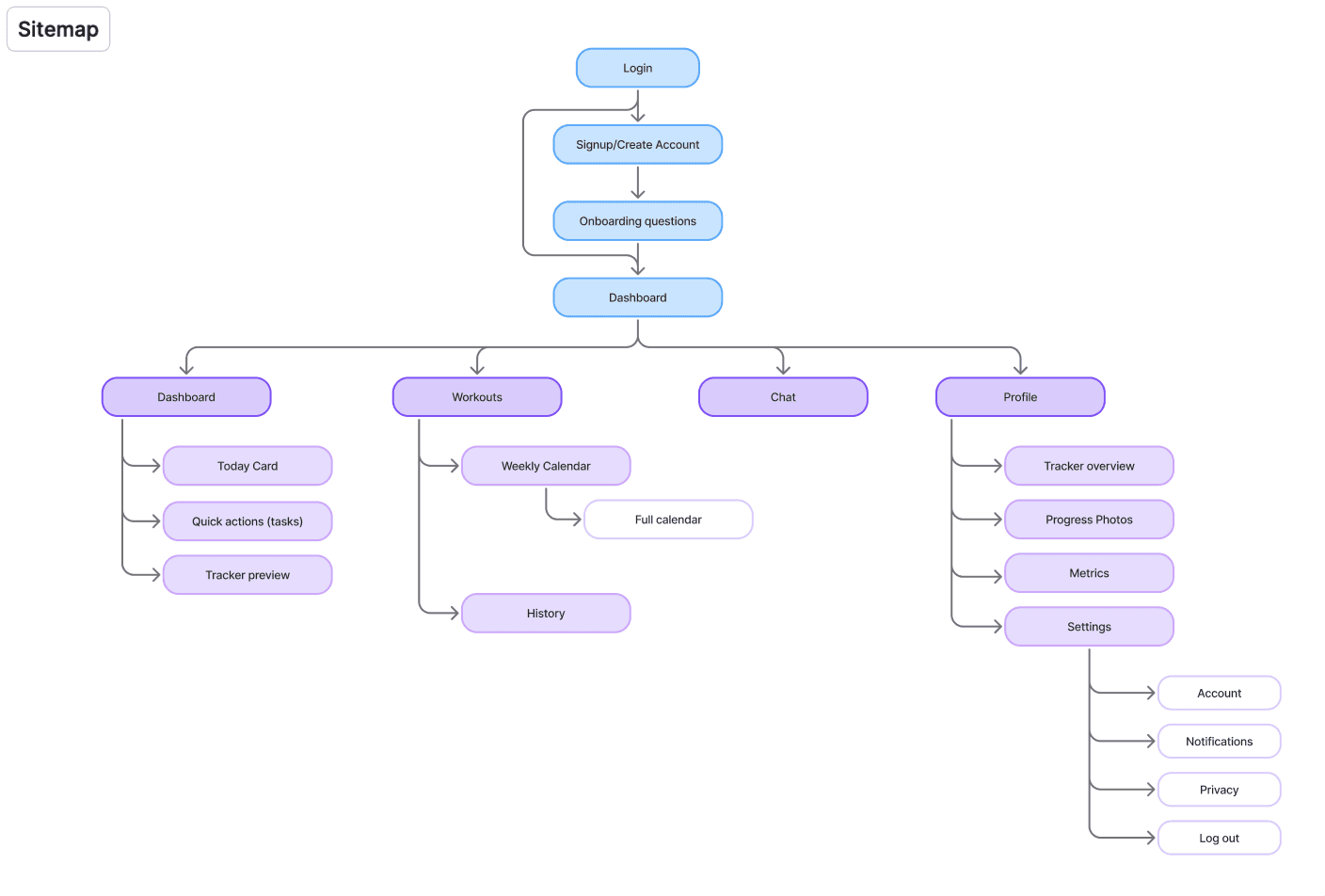
Sitemap
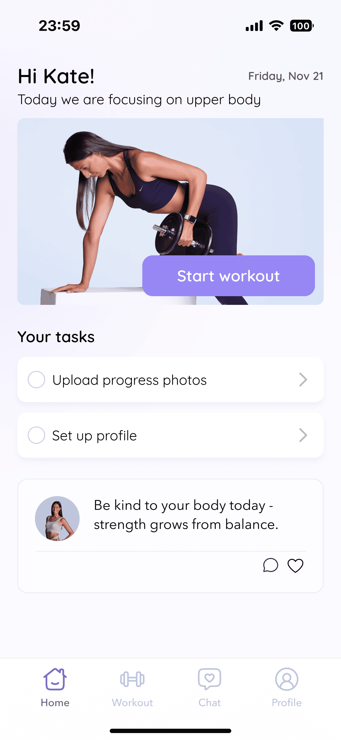
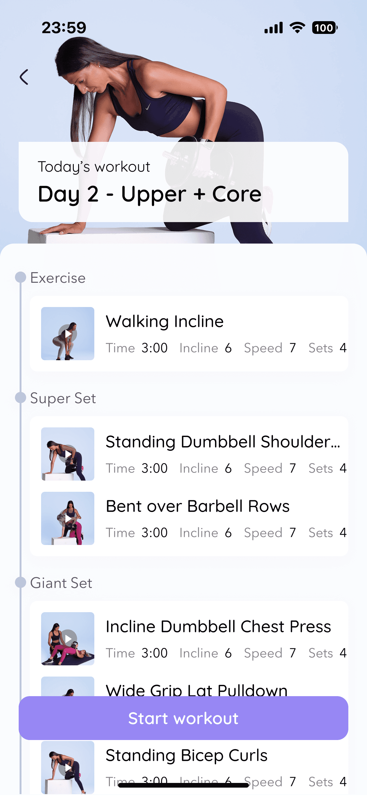
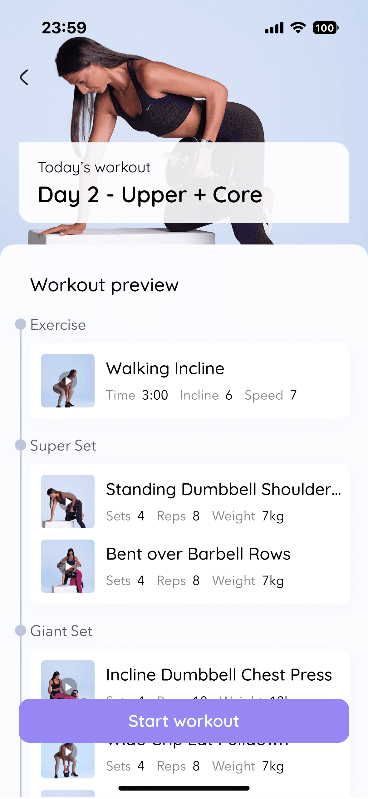
The dashboard needed to be a daily ritual, not a to-do list
I structured the app around clarity and frequency of use, placing the dashboard at the center. The architecture prioritizes the most common daily actions while keeping secondary features accessible but unobtrusive.
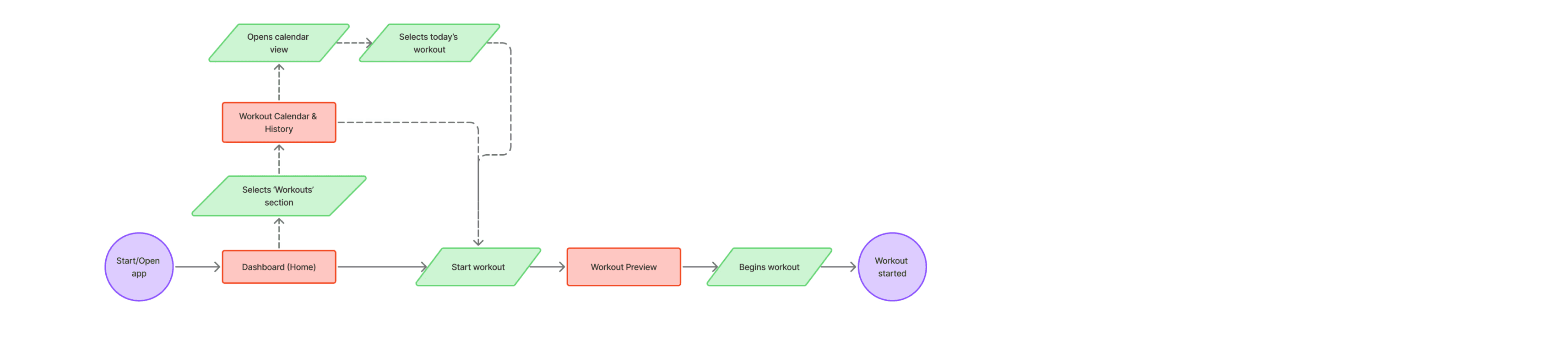
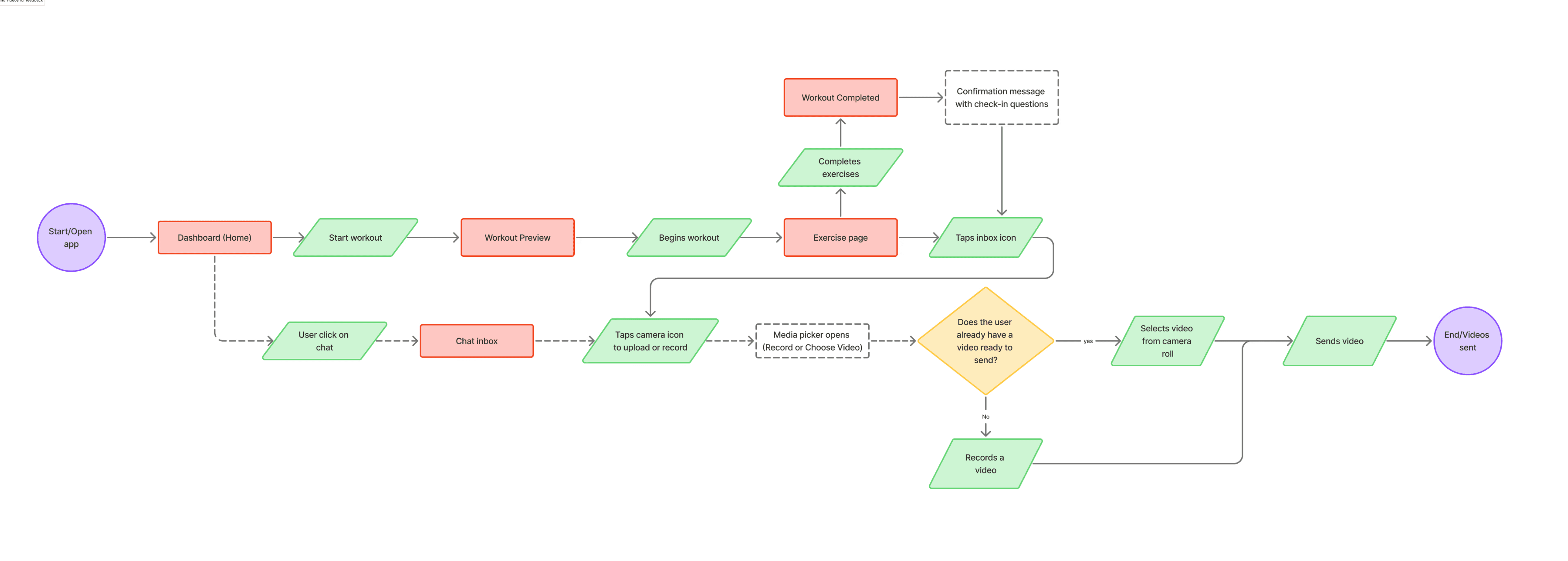
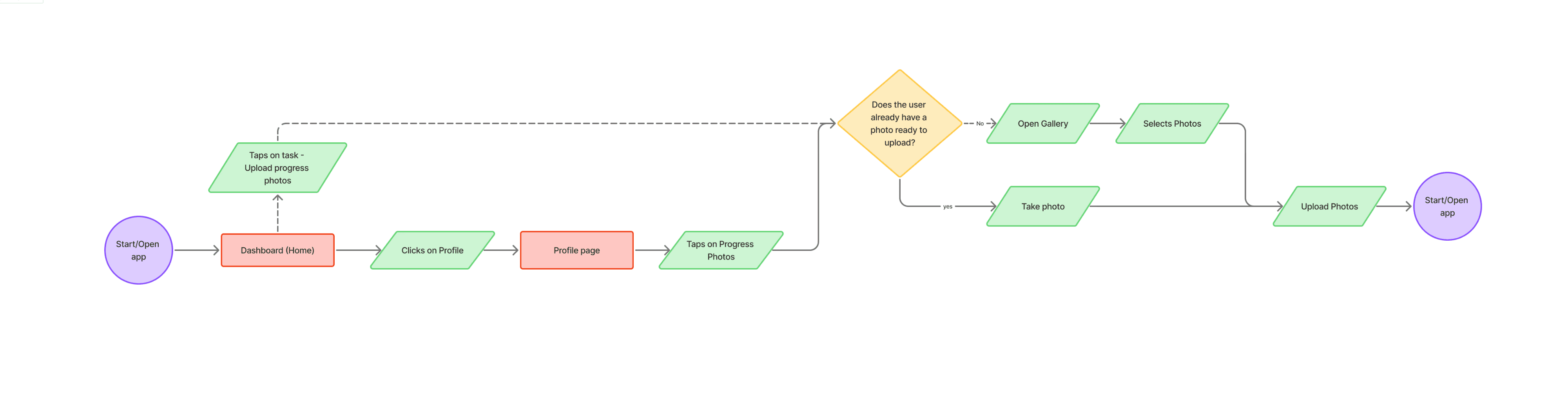
USER FLOWS
Four critical tasks mapped before screens were drawn
I focused on the core daily actions clients perform in Anita's coaching experience - ensuring the product felt focused and intuitive before moving into visual design.
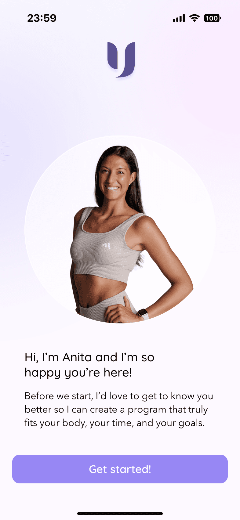
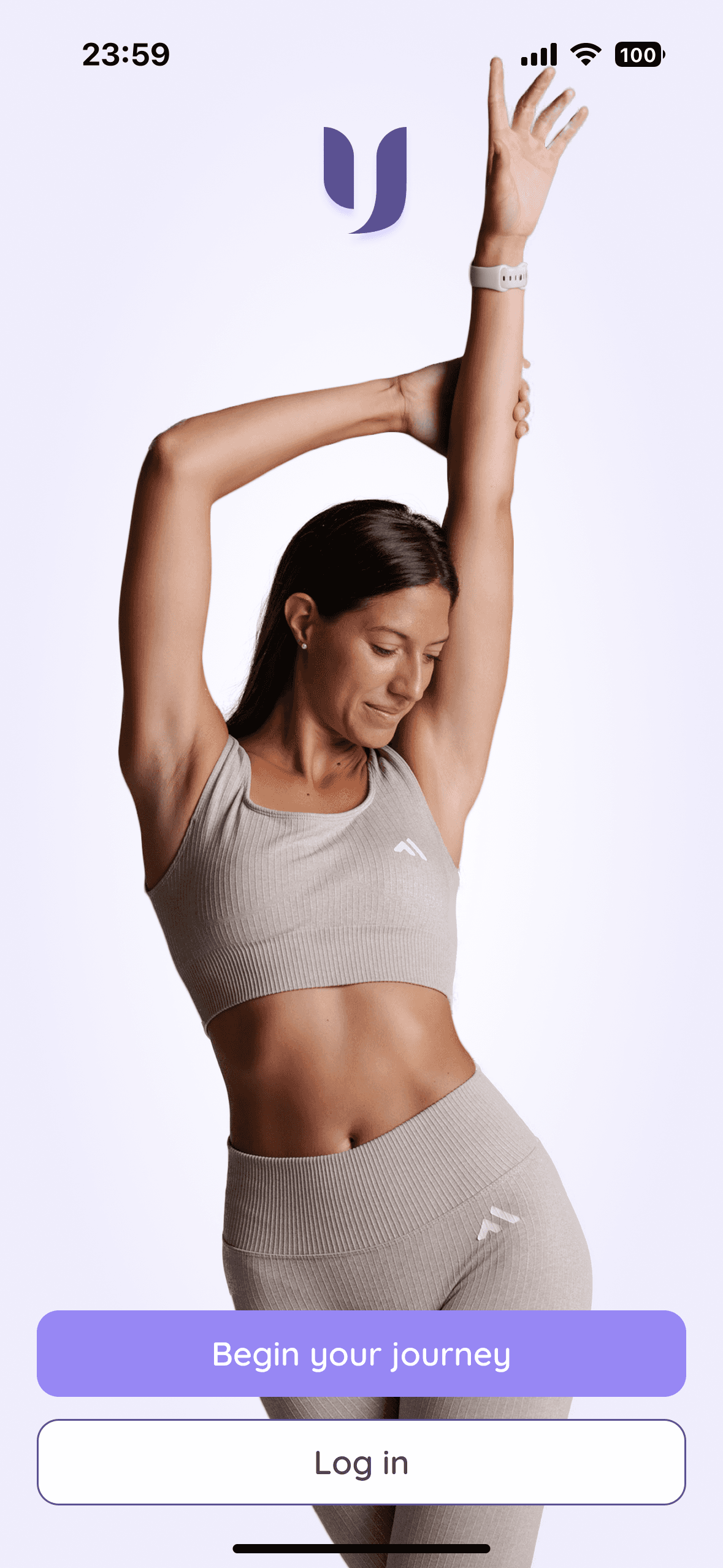
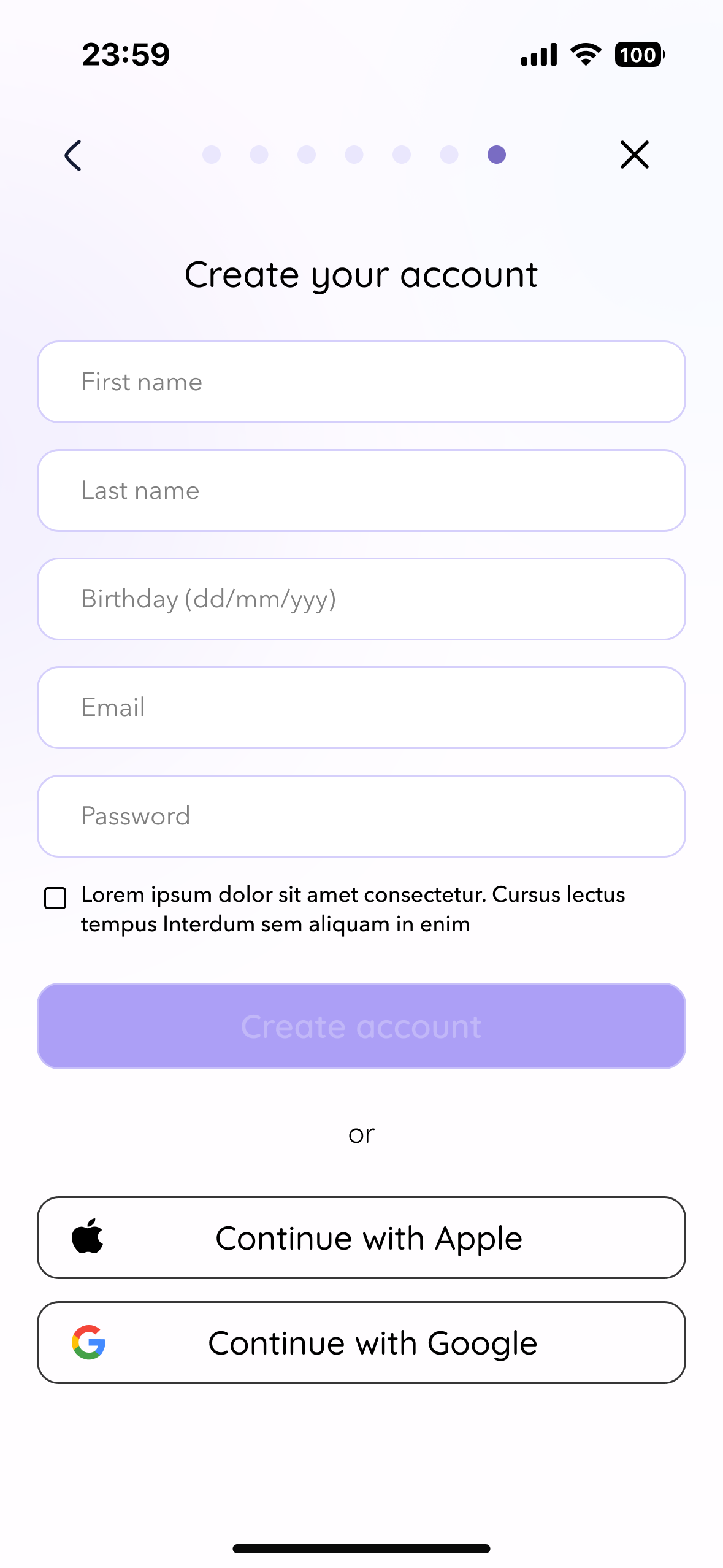
Onboarding & Account Creation

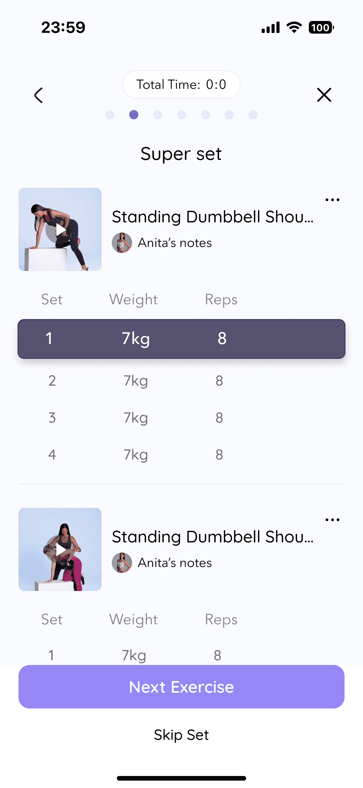
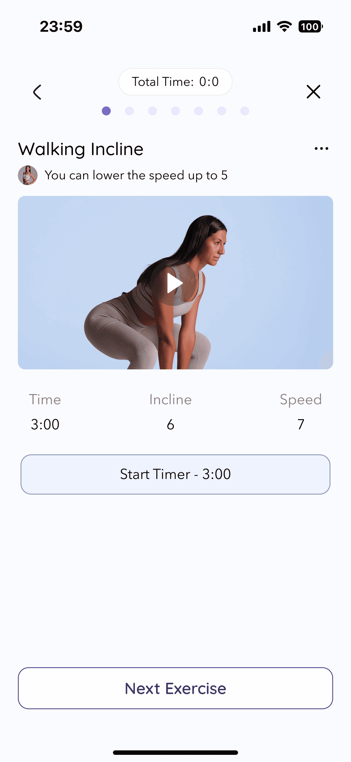
Starting a Workout
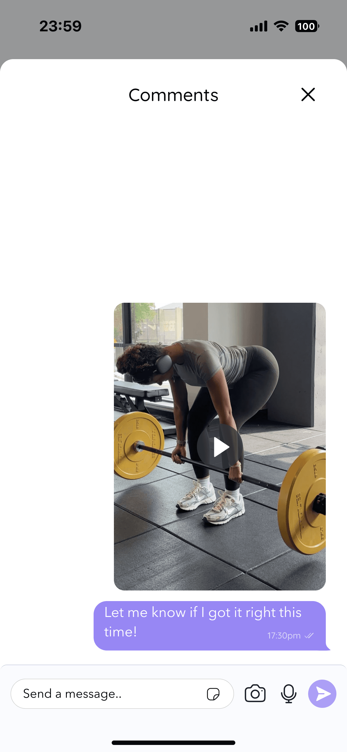
Sending a Form‑Check Video
Uploading Progress Photos & Completing Tasks
FROM SKETCH TO STRUCTURE
Four flows, one principle - reduce every decision the user shouldn't have to make
Across onboarding, workout, form check, and progress tracking, every structural choice pointed at the same goal: remove friction from the moments that matter most. Microcopy in Anita's voice at sign-up. A dashboard-first entry point before every workout. Bottom-sheet overlays to keep feedback contextual. Front/side/back labeled slots to make progress photos effortless.
Onboarding
Message-style microcopy, skip option, progress indicator
→ Reduces cognitive load while preserving emotional warmth from first interaction
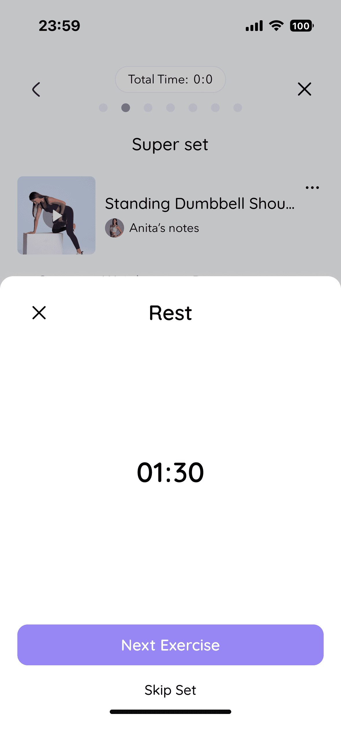
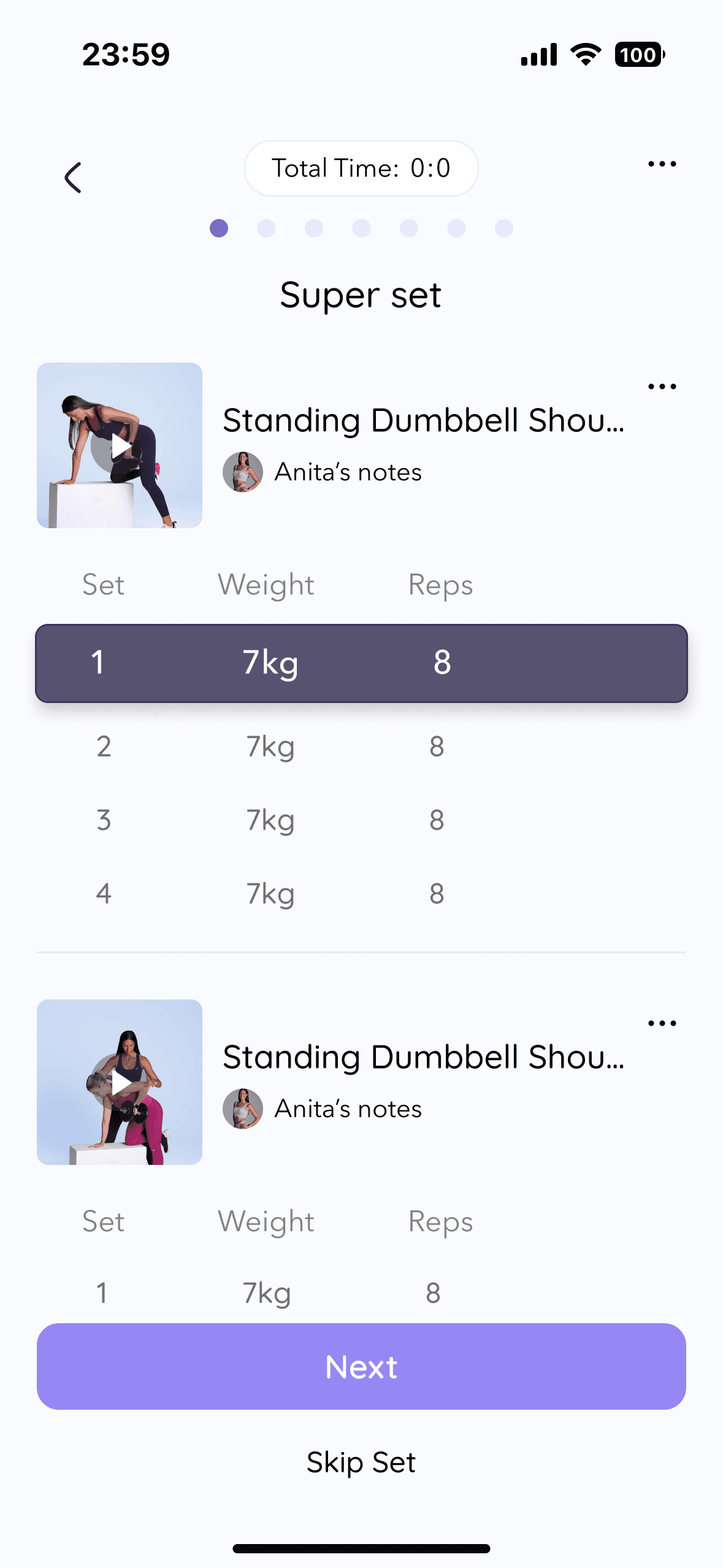
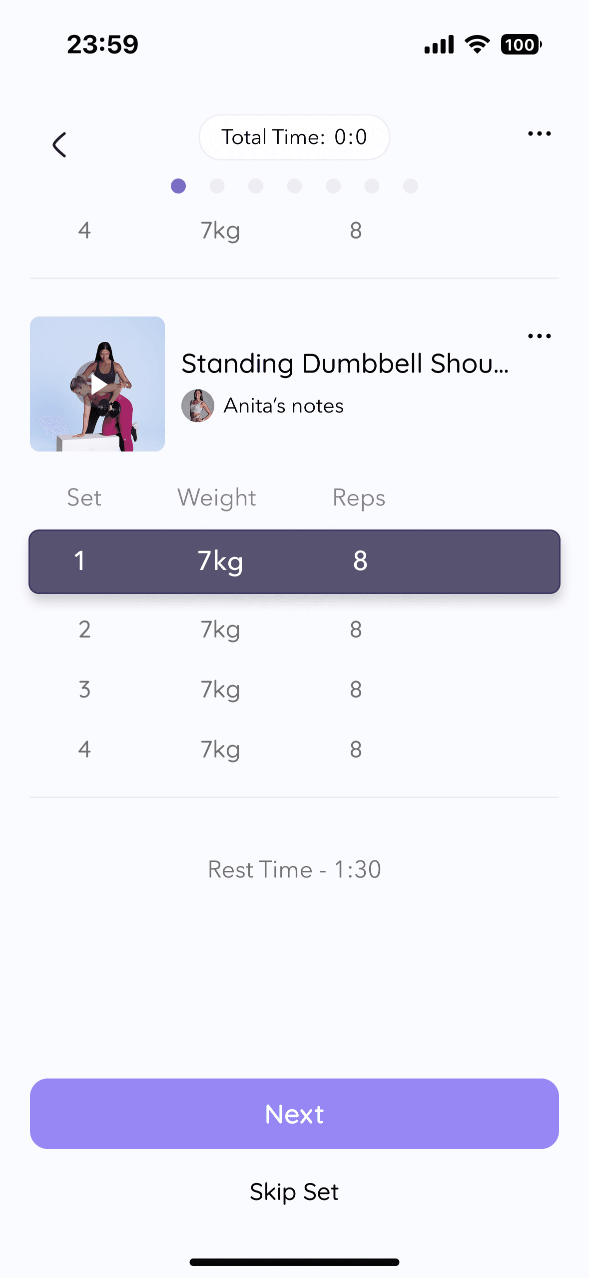
Workout
Dashboard-first entry, step-by-step view, auto weight memory
→ Eliminates decision fatigue — users focus on the exercise, not navigation
Form Check
Bottom-sheet overlay, messages tied to specific exercises
→ Feedback happens in context, without breaking the flow
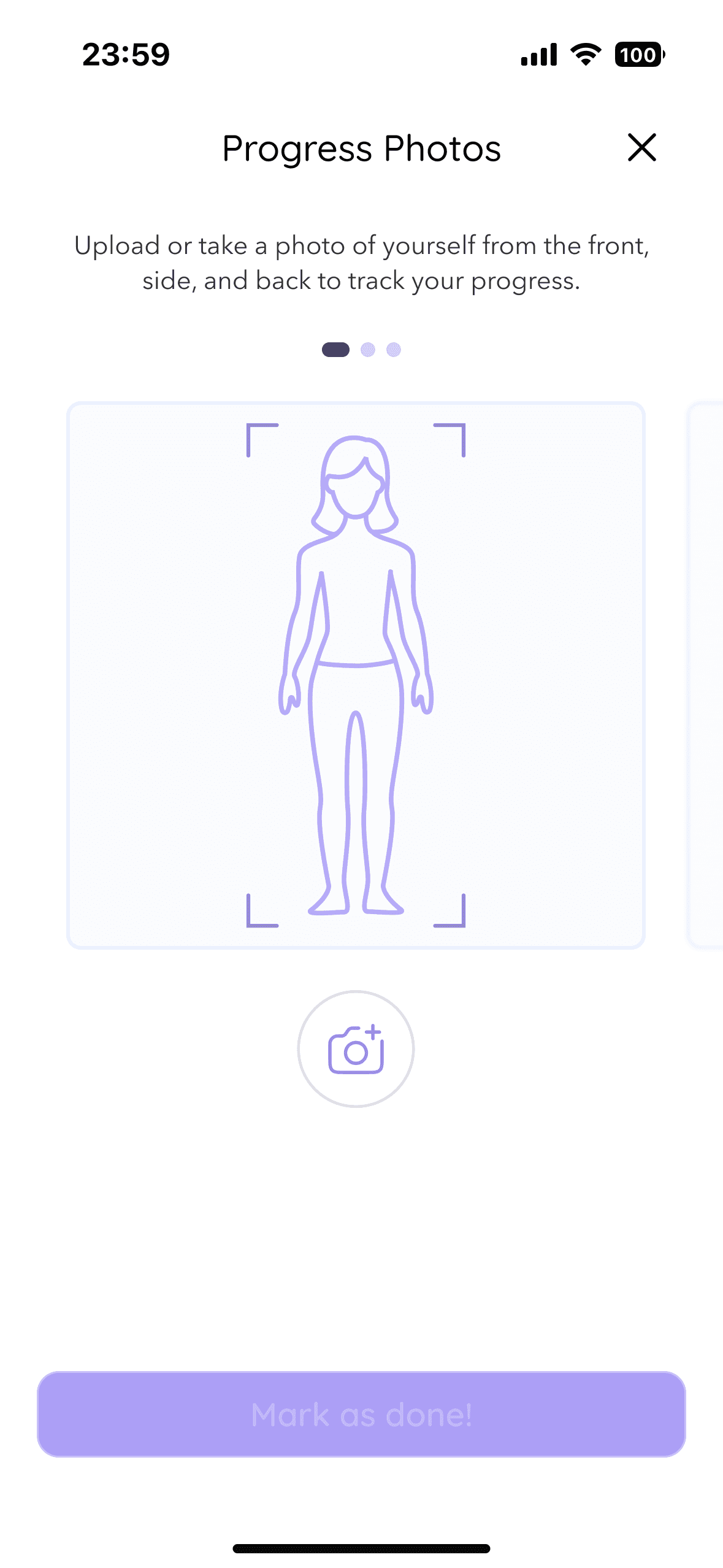
Progress Photos
Front/side/back slots, quick upload, completion feedback
→ Creates gentle accountability without requiring manual follow-up from Anita

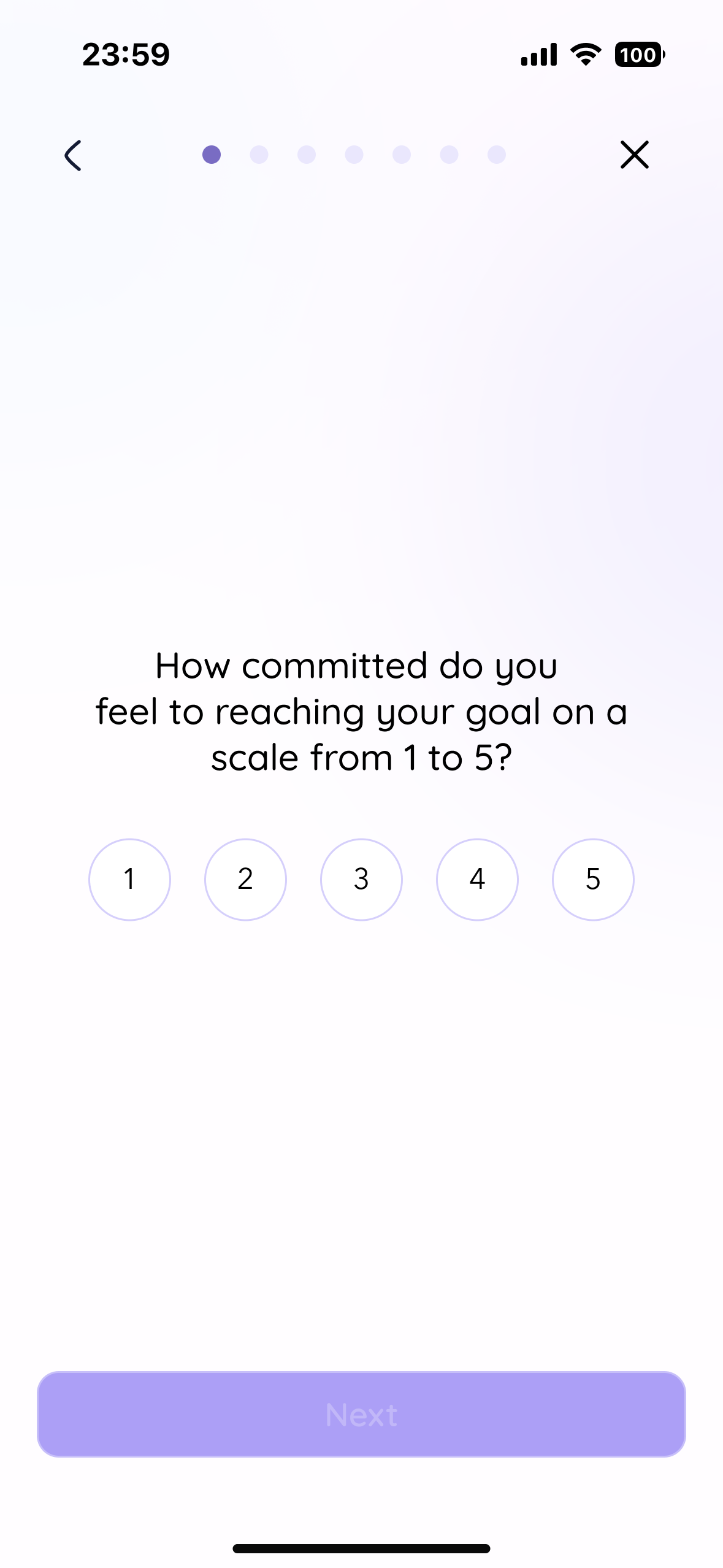
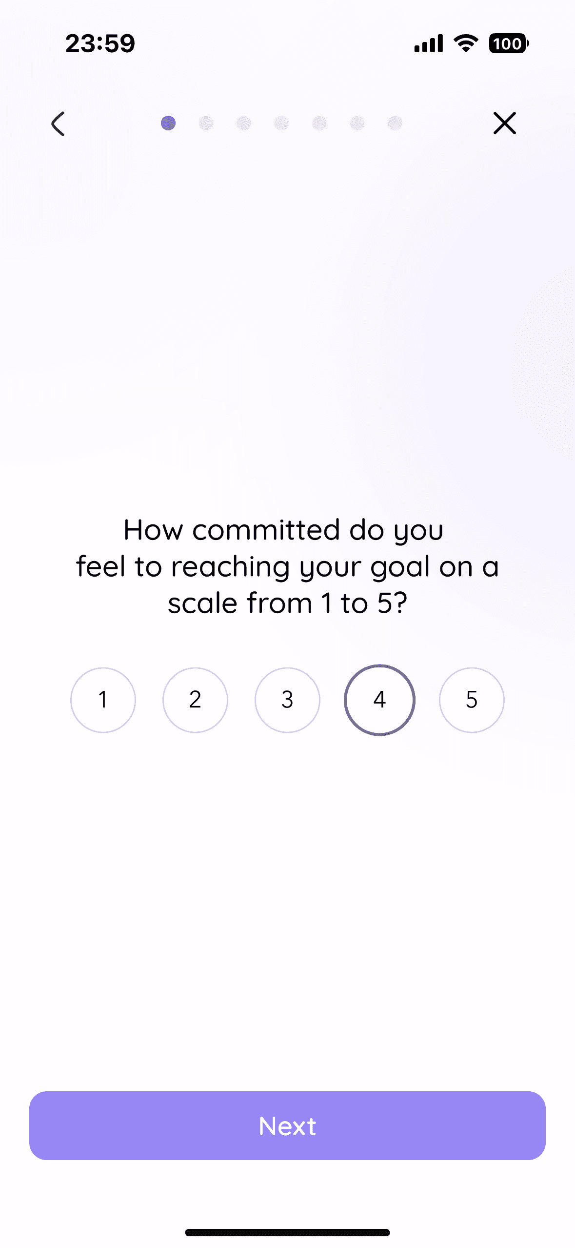
MID-FIDELITY TESTING
Testing the structure before committing to any visual decisions
3 participants · 4 flows · 25–35 min remote sessions via Google Meet.
Goal: validate navigation logic and flow clarity before moving to high fidelity.
The usability tests confirmed that the core structure of the app is solid and intuitive. Most friction points are tied to mid-fidelity limitations such as unclear icons, missing visual hierarchy, and placeholders. Users completed every task, understood the general purpose of each flow, and reacted positively to the overall experience.
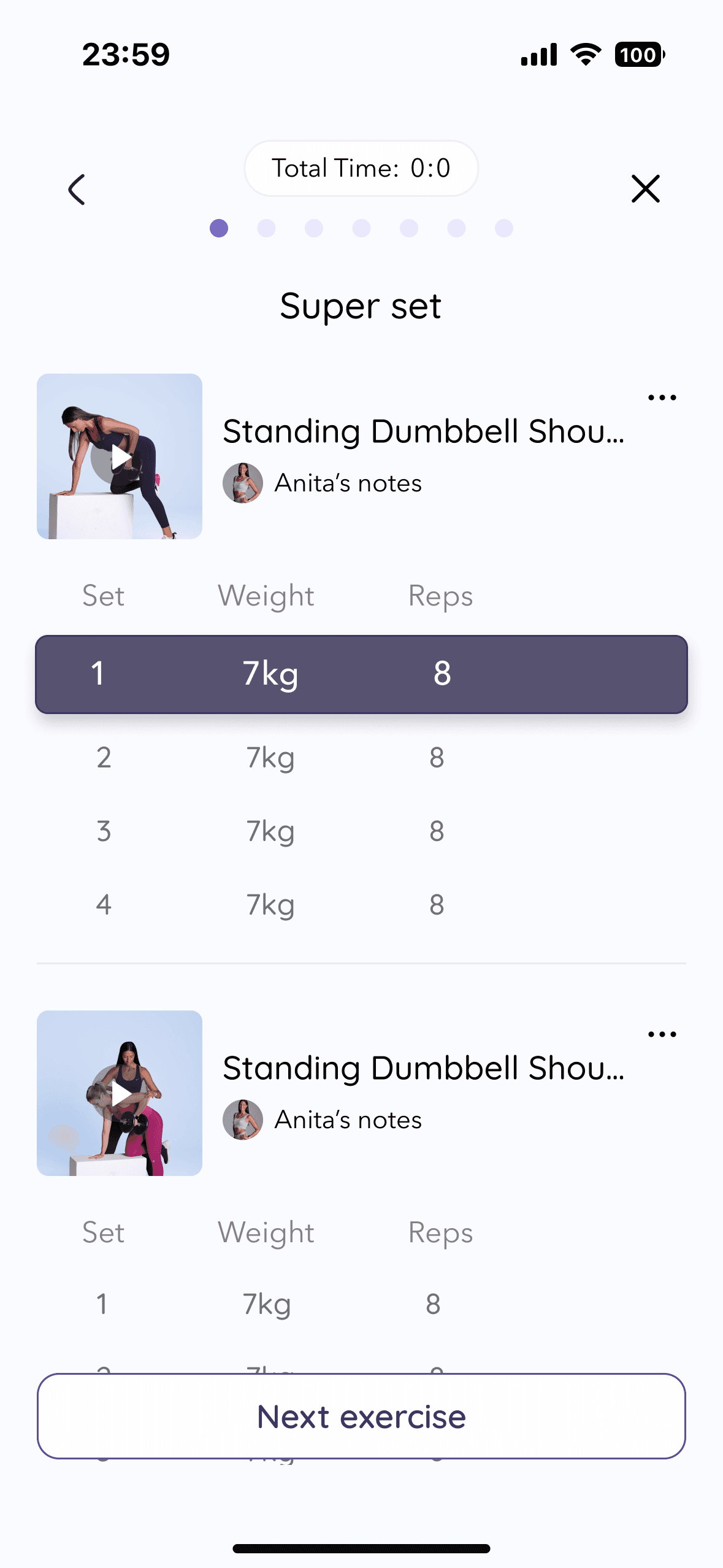
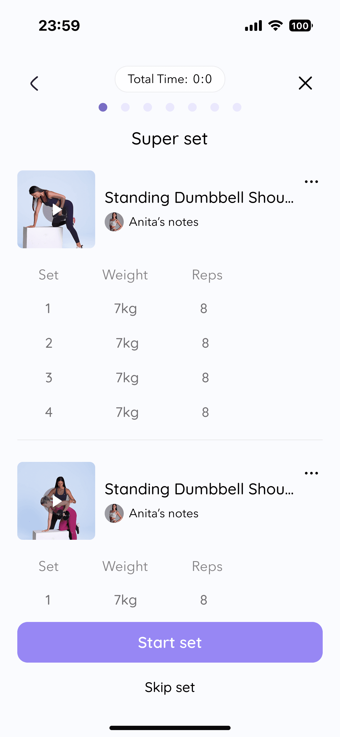
What needed refinement
Workout
• Superset grouping unclear - users couldn't tell if exercises were separate or grouped
• "Next" button meaning ambiguous — next exercise, or next set?
→ Stronger visual separation + clearer microcopy
Form Check
• Chat icon didn't read as a chat button in workout context
→ Icon redesigned with label for first-time context
Progress Photos
• Three empty squares had no labels - users asked "front, side, back?"
→ Labels added to each slot
branding
From 'Anita Body & Mind' to UPLIFT: a brand that balances warmth with ambition
Before moving into high-fidelity, I refined Anita’s brand to ensure the product could scale beyond a personal identity while still preserving warmth. Research showed users didn’t just want reassurance — they wanted to feel strong and empowered. This insight shaped the evolution from “Anita Body & Mind” to UPLIFT.
The new identity balances softness with structure - combining calm tones with a stronger accent and a refined symbol that suggests growth, movement, and femininity without cliché.
The brand system directly informed the UI - rounded shapes reinforce approachability, soft purples create emotional safety, and bold accents guide attention during workouts. Typography balances warmth and clarity, ensuring the interface feels supportive rather than clinical.
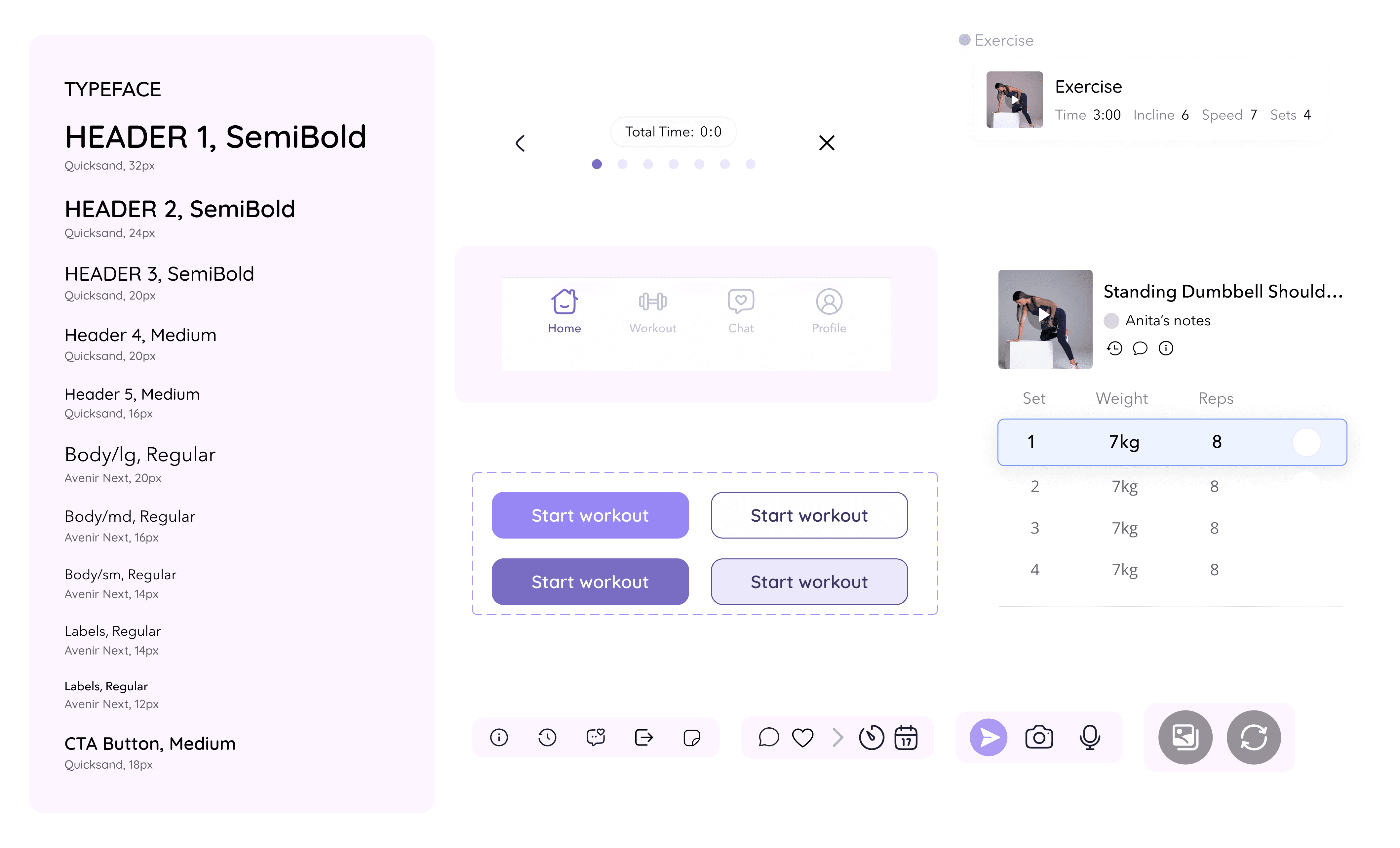
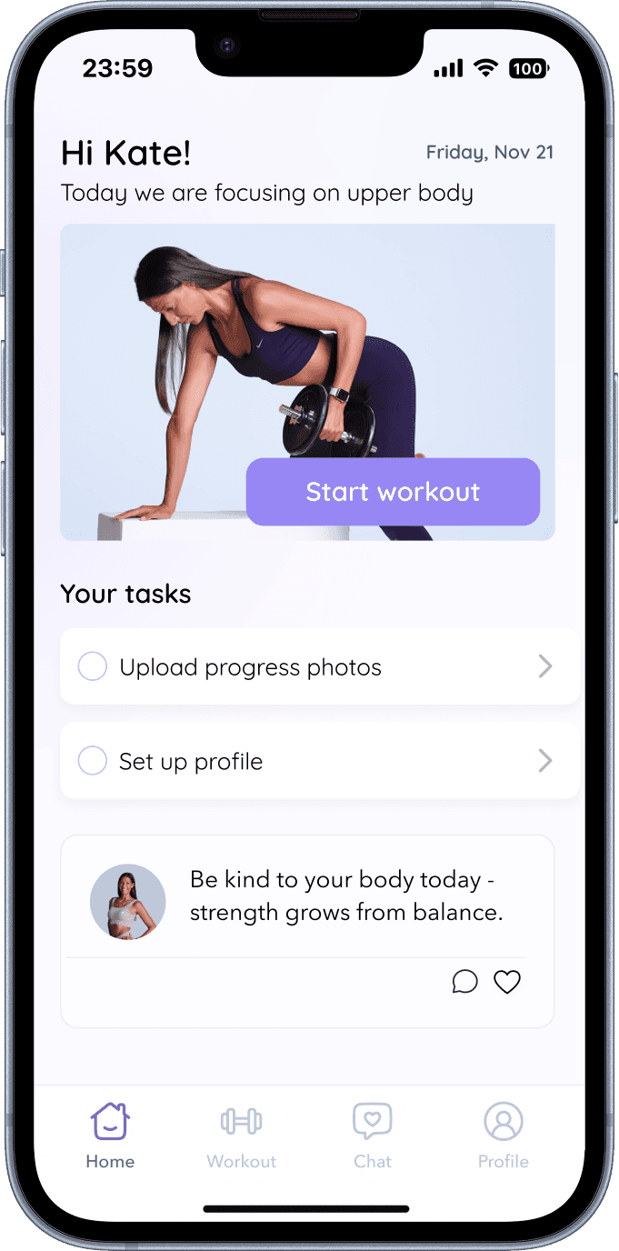
High fidelity
Anita's presence translated into every single screen
Her own images and videos appear throughout the app — making it feel like she's there with users during their workouts. Soft gradients add warmth, bold accents guide attention during key actions, and the overall tone stays calm and supportive rather than clinical or transactional.
TESTING & ITERATIONS
Validating the hi-fi prototype with real target users
3 participants · 4 flows · 25–35 min remote sessions via Google Meet.
Goal: validate the high-fidelity prototype with real target users before finalising the design.
Iterations

Final Outcome
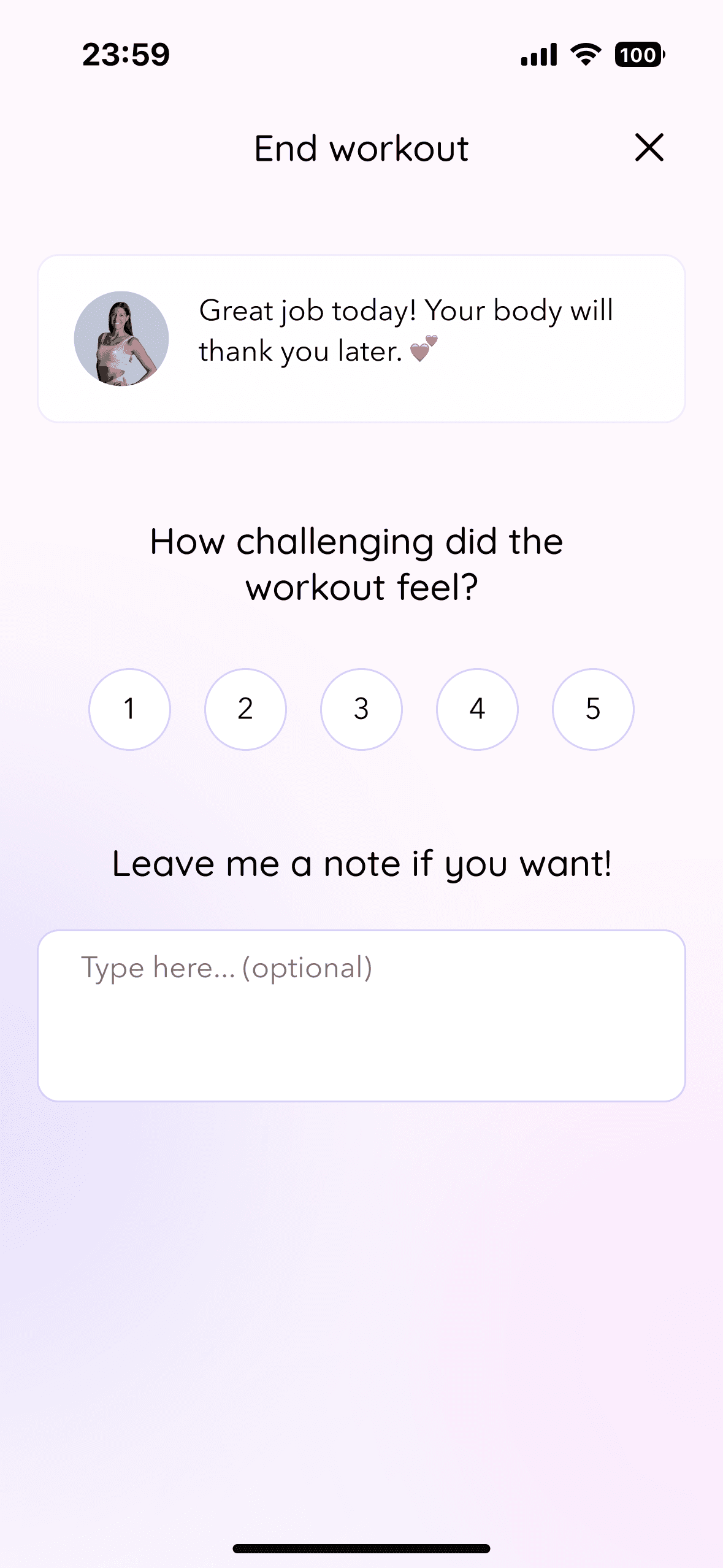
Unified, emotionally aligned coaching platform
The final high-fidelity prototype delivers a unified, emotionally aligned coaching platform that replaces fragmented tools with one cohesive system. Testing validated the core structure, requiring only clarity and micro-interaction refinements. The result balances operational efficiency for Anita with consistent motivation and support for her clients.
Final Takeaways
Key lessons that changed how I work:
Research became my advocacy tool. When stakeholder opinions conflicted with user feedback, I learned to walk through insights diplomatically rather than just saying "the data shows..."
Explaining "why" matters as much as the design itself. Building trust with clients means grounding every decision in research and showing your thinking, not just deliverables.
Testing structure before polish saved weeks of rework. Validating IA in mid-fidelity prevented costly visual revisions.
Emotional connection is the product. In-app messaging wasn't just a feature request — it was the moment users said they'd feel truly supported.